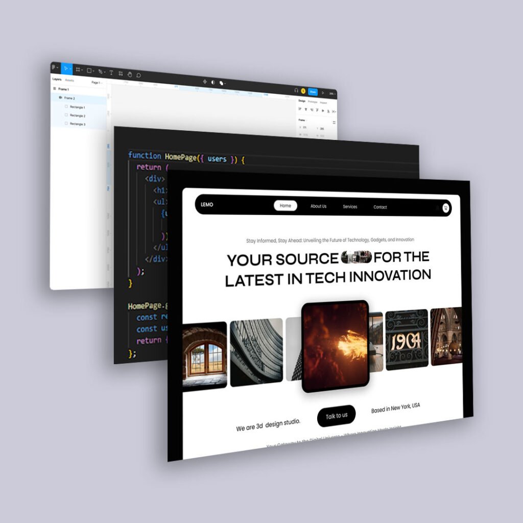
We’ve known for years that people scroll. But in 2025, they’re scrolling differently.
Faster. More passively. Often while multitasking. And they’re not giving your top section more attention out of respect. They’re glancing, sensing, and moving on.
That means old layout assumptions—like stuffing everything important “above the fold”—are starting to fall apart.
Here’s why top-heavy design is becoming less effective, and how to create scroll-friendly experiences that actually guide user behavior.
1. The Fold Is a Fluid Concept
In a multi-device world, there is no single fold.
What appears in the first view on a phone might barely scratch the hero image on a desktop. Prioritizing a single fold often leads to bloated, crowded intros that try to do too much.
Instead:
- Design content to breathe
- Assume users will scroll—but only if they trust there’s more worth seeing
2. People Don’t Read Top to Bottom. They Scan for Signals.
Modern users scan by:
- Headline hierarchy
- Visual rhythm and whitespace
- Section intros or subheads
If everything important is stacked up top in a dense block, it doesn’t feel valuable. It feels anxious. People scroll not just to find information, but to find relief.
Use that to your advantage.
3. Scrolling Is a Behavioral Filter
Every scroll is a micro-yes. Each downward motion signals curiosity, investment, or at least tolerance.
Design your scroll path like a narrative:
- Start strong, but don’t oversell
- Let each section answer a new question
- Build momentum visually and cognitively
The goal isn’t just to keep people scrolling. It’s to reward their decision to keep going.
4. Modular Layouts Create Scroll Pacing
Instead of long paragraphs or indistinguishable blocks, use modular design:
- Alternating background colors or spacing changes
- Visual anchors like icons, callouts, or quote blocks
- Chunked information with clear breaks
These elements give scrollers mental pauses and make long content feel lighter.
5. Above the Fold Still Matters—Just Not How You Think
The top of your page sets the tone. It should:
- Signal clarity
- Create intrigue
- Set expectation
But it shouldn’t try to close the deal. If your user converts in 5 seconds, great. But if they need more time, your layout should respect their scroll.
6. AI Summarization Makes Scroll Integrity Even More Important
With tools like Google SGE and ChatGPT pulling summaries or previews, every section of your page might be surfaced independently.
That means:
- Every block should stand on its own
- Headers should describe what follows
- Content should remain readable out of context
You’re not just designing a scroll experience anymore. You’re designing for selective surfacing.
Final Thoughts
Scrolling isn’t failure. It’s curiosity in motion.
So stop trying to front-load every insight, CTA, and hook. Let your layout breathe. Let your story unfold.
Because in 2025, good design isn’t just visible at the top. It’s experienced through the scroll.


