We’re Entering the Backlash Phase of Digital Perfection
Every year, companies roll out a shiny new stack of design trend reports, each one confidently predicting the next big thing: colors, typography, layouts, textures, aesthetics, and whatever buzzword LinkedIn is currently taking for a joyride.
Most are fine. Some are even useful. But a shocking number read like someone spent three hours scrolling Pinterest, then decided the world urgently needed a 40-page PDF about the spiritual journey of rounded corners.
But Adobe’s 2026 Creative Trends report caught my eye for a different reason. Not because the trends themselves are about to knock anyone’s socks off, but because nearly every single one keeps orbiting the same gravitational pull:
People are officially over the era of polished digital perfection.
And honestly, I don’t think this is just a design trend. It feels more like a collective allergic reaction.
The Real Trend Isn’t Maximalism. It’s Humanity.
The report discusses hand-rendered typography, collage aesthetics, tactile textures, layered storytelling, regional influences, emotional design, and intentionally imperfect layouts.
But the thread running through all of it isn’t really a visual movement—it’s more like a group-wide case of creative burnout.
For years, digital design moved toward optimization.
Cleaner systems. Sharper grids. Kerning so perfect you could eat off it. Minimal interfaces. Branding so sanitized it could double as a hospital gown. Everything buffed to a mirror shine, then sent through fourteen rounds of stakeholder feedback until it barely remembers what it once was.
And AI accelerated that feeling dramatically.
Now we’re up to our necks in content that checks every technical box but leaves us emotionally high and dry.
Perfect lighting. Perfect gradients. Perfect formatting. Perfect sentence structure.
There’s nothing to hold onto. It all just slides right by.
Adobe’s report cites research showing that 82% of global consumers now expect brands to engage their senses as much as possible when introducing something new. That number matters because it means people are officially done settling for flat efficiency. They want texture. Emotion. Surprise. Something that actually sticks.
Not fake “human-centered branding” language.
Actual humanity.
Everybody Optimized for “Professional”
Honestly, I think that’s why so many brands now feel like they were separated at birth.
Everybody optimized for “professional.”
Nobody optimized for memorable.
Adobe also reports that content demands have ballooned by 5x to 20x in recent years, which honestly explains a lot. When companies are churning out content at that pace, personality is usually the first thing tossed overboard in favor of consistency, speed, and sheer volume.
And you can feel it online.
Everything starts to look as if it were designed by the same SaaS startup, somewhere in a pastel-filled conference room.
- The same softened minimalism.
- The same abstract gradients.
- The same stock photo diversity smiles.
- The same perfectly safe copy.
- The same emotionally neutral tone, tiptoeing around in case a stakeholder somewhere might get the vapors.
At some point, optimization stopped making brands feel polished and started making them feel indistinguishable.
The Tiny Imperfections Are Becoming the Fingerprint
That’s what made Adobe’s report actually interesting to me.
Beneath all the trend-forecasting jargon, what it’s really tracking is a growing hunger for proof that an actual human was here.
- Texture.
- Specificity.
- Personality.
- Imperfection.
- Warmth.
Things that feel like someone actually touched them, instead of being spit out by a system trained on six billion slightly shinier versions of the same idea.
And weirdly, I don’t think this shift is only happening in visual design.
I think it’s happening in writing too.
People are getting suspicious of anything that sounds too polished. The cleaner and more optimized the message, the more it feels like it was written by a robot with a LinkedIn account. Not because polish is evil, but because perfection without personality just feels fake.
And honestly, audiences are getting scarily good at sniffing that out.
- A strange crop.
- An oddly specific joke.
- A sentence that runs a little too long because someone got excited and forgot to come up for air.
Those things used to get edited out. Now those quirks are starting to feel like proof of life.
Why Chaotic Design Suddenly Feels Refreshing
Even the more chaotic design trends Adobe spotlights don’t feel random—they feel like a rebellion.
- People want room to breathe again.
- Room for contradiction.
- Room for personality.
- Room for things that don’t look focus-grouped into oblivion.
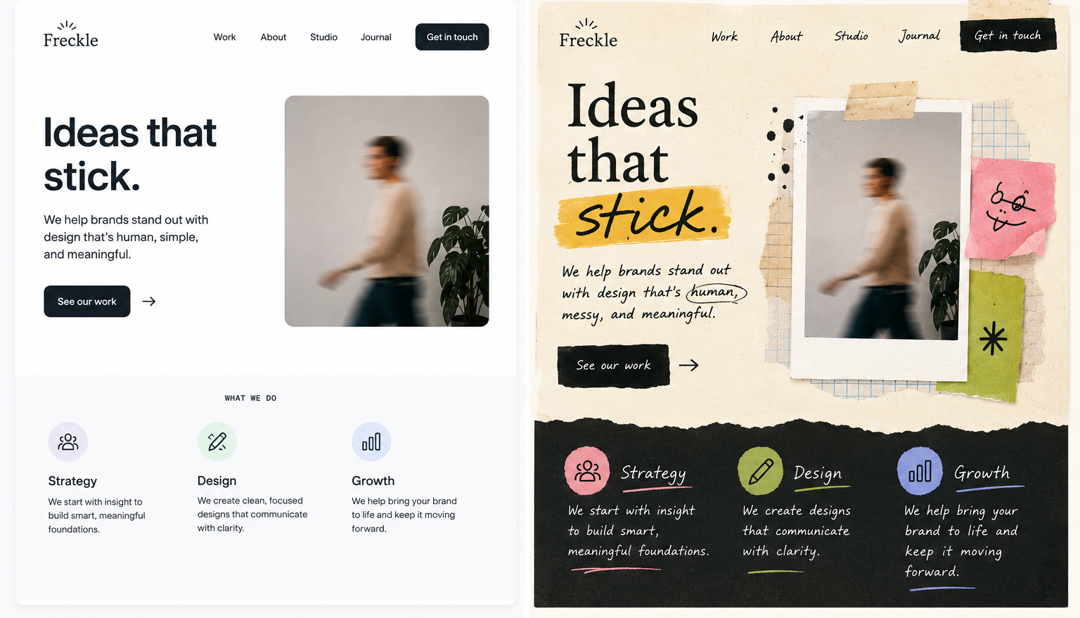
That’s why textured collage work, scrapbook vibes, handwritten type, layered storytelling, grainy photos, and layouts with a few rough edges are suddenly back in style. They break up the endless scroll of algorithm-approved sameness we all swim through every day.
They feel human, the way a handwritten note feels different from a calendar invite that just showed up to ruin your afternoon.
Not cleaner.
Just more alive.
AI May Actually Increase the Value of Human Creativity
And just to be clear, I’m not here to bury clean design. Minimalism still works wonders when there’s real intention behind it. Some of the best branding on the planet is practically zen.
But there’s a big difference between restraint and sterility.
A lot of digital design quietly tiptoed over that line years ago.
The irony is that as AI gets better at generating polished creative work, the value of unmistakably human creative work is likely to increase.
Not because human work is always technically better.
But because people are starting to crave little signs that an actual person was here.
Adobe’s report includes a quote from Apple VP Tor Myhren saying, “The human touch is our superpower.”
I think that might be the creative truth that defines the next few years.
Because people don’t just want content that looks impressive anymore.
They want content that feels alive.