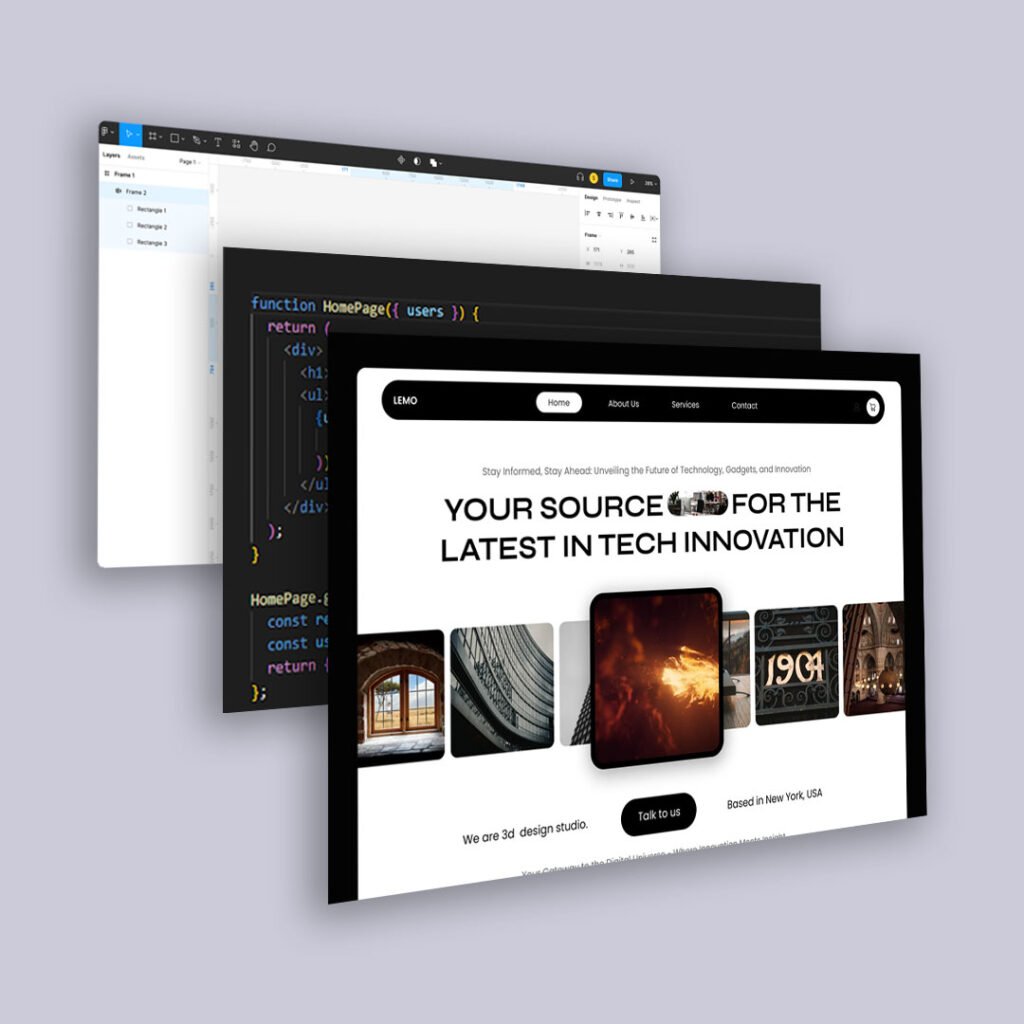
You’ve spent hours crafting the perfect website copy, but visitors aren’t reading it. Instead, they skim, scroll, and leave. Why? Because people don’t read websites the way they read books. Online, attention spans are shorter, and users want instant answers. Understanding the psychology of scannable content is key to keeping users engaged and driving conversions.
The Science Behind Online Reading Behavior
Research in UX and behavioral psychology has consistently shown that users don’t read web pages word for word. Instead, they scan for relevant information. Studies by the Nielsen Norman Group found that:
- Users typically read only 20-28% of the words on a page.
- The majority of scanning follows an F-pattern or Z-pattern, meaning they focus on headlines, bolded text, and the first few words of paragraphs.
- Too much text overwhelms users, leading to higher bounce rates and lower engagement.
Understanding this behavior is crucial for designing web content that actually gets read.
Why Users Avoid Dense Blocks of Text
- Cognitive Load – Walls of text require too much mental effort to process quickly.
- Lack of Visual Hierarchy – Without clear structure, users can’t quickly find what they need.
- Time Constraints – Users often visit websites with a goal in mind and don’t have time to read everything.
- Distractions – With notifications, social media, and competing tabs, users are easily pulled away.
How to Make Your Content Scannable
- Use Headings and Subheadings
- Break up content with clear, descriptive headings.
- Users should be able to understand the main points just by skimming them.
- Keep Paragraphs Short
- Stick to 2-3 sentence paragraphs for easier readability.
- Each paragraph should focus on one key idea.
- Use Bullet Points and Lists
- Lists make information easier to digest.
- They also help highlight key points users are scanning for.
- Highlight Key Information
- Use bold text, italics, or color to emphasize important words.
- Avoid overusing these elements—too much formatting can create visual noise.
- Leverage Visuals and White Space
- Use images, icons, and whitespace to break up content.
- Well-spaced content feels less overwhelming and encourages deeper engagement.
- Prioritize the First Few Words
- People often only read the first few words of a sentence before deciding whether to continue.
- Place important information at the beginning of paragraphs and bullet points.
- Optimize for Mobile
- Over 50% of web traffic comes from mobile devices.
- Ensure text is easy to scan on smaller screens with responsive formatting.
Final Thoughts
People don’t read websites—they scan them. By structuring your content for quick readability, you make it easier for users to find what they need, stay engaged, and take action. If you want your message to stick, design your content to be scannable, skimmable, and instantly impactful.


