A few weeks ago, I shared a post on LinkedIn about designing for the fog—what it means to build digital experiences for people who aren’t operating at 100%: cognitively, emotionally, or physically. This piece is a continuation of that conversation.
Because the more I reflect on it, the more I realize how much of our digital design work assumes ideal conditions.
We assume the user is focused. That they’re calm. That they’re able-bodied. That their Wi-Fi is stable and their mind is clear. That they want to explore, compare, and engage.
In other words, that everything is fine.
But everything is not always fine. And most users aren’t showing up ready to perform.
Designing for the Day Everything Goes Right? That’s Easy.
Best-case UX is clean. It’s simple. It behaves beautifully in demos and review decks. And it completely unravels the second a user shows up burned out, undercaffeinated, distracted, grieving, in pain, overwhelmed, or simply short on time and energy.
Real-world users are often showing up in pieces. They’re rushing. They’re mid-flare. They’re doom-scrolling between appointments. They’re managing kids while navigating a healthcare portal. They’re stressed about money, unsure about the next step, or trying to solve a problem without knowing the right language to ask for help.
Designing for that user isn’t a soft skill. It’s a requirement.
The Shift in My Own Approach
After going through cancer treatment and reconstructive surgery, I started interacting with digital products differently. I stopped evaluating them like a strategist and started experiencing them like someone just trying to survive the page.
When I couldn’t focus or think clearly, every extra button, every unnecessary decision, every unclear call to action felt heavier than it should have. These weren’t minor UX flaws—they were exits. They were abandonment points. They were moments where the design asked too much.
That experience changed how I approach UX and development today.
Real UX Shifts That Reflect Real-World Use
Here are a few practical ways I design and build differently now:
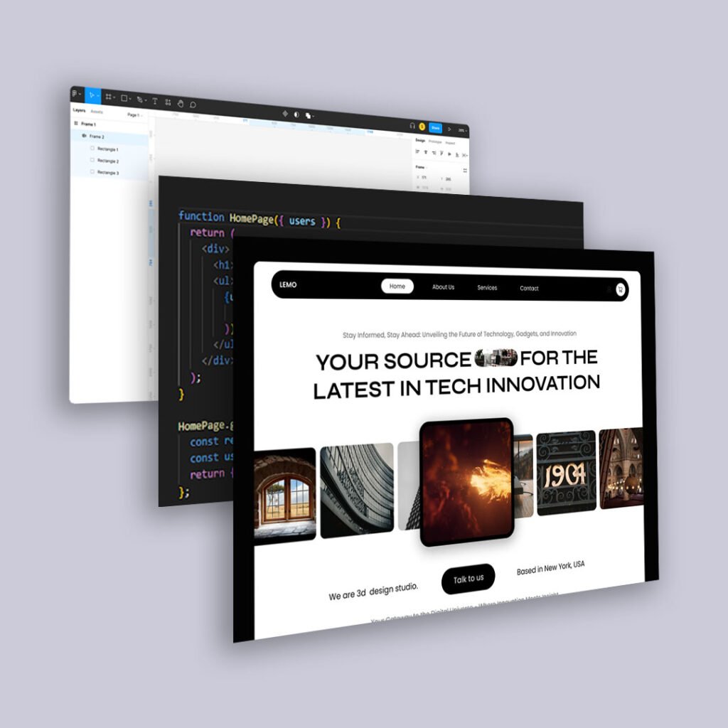
1. Flexible, Structured Content with Headless CMS
Instead of relying on locked templates or visual page builders, I use headless CMS setups that allow content to adapt to user context. This gives marketing and content teams the power to tailor the message—or reduce the load—without breaking the layout.
This also means:
- Modular call-to-action blocks
- Conditional content for returning vs. first-time users
- Microcopy that can shift tone based on user journey stage
When people are overwhelmed, content hierarchy matters more than aesthetics.
2. Emotionally Aware CTAs
“Get Started” doesn’t mean anything when a user doesn’t know what they’re getting into.
I now test CTAs like:
- “Walk Me Through It”
- “Explore Without Committing”
- “Save for Later”
The goal isn’t just to drive action—it’s to reduce resistance. If you design your funnel like every user is confident and ready, you lose everyone who isn’t.
3. Forms That Feel Like Conversations
Lengthy, rigid forms are overwhelming to people in high-stress moments.
Now I prioritize:
- Progressive disclosure (showing fields as needed)
- Smart defaults
- Clear error messaging that reassures, not reprimands
No one wants to feel like they failed a quiz just to complete a checkout.
4. Thoughtful Defaults and Recovery Paths
Behavioral science tells us the default matters. When someone is tired, they tend to go with the path of least resistance. So I design for:
- Defaults that are genuinely helpful (not just convenient for the business)
- Clear exits and soft re-entries if someone changes their mind
- Error states that give people a way forward, not just a red flag
Clarity and recovery are as much a part of good UX as flow.
The Takeaway
Good UX works when everything is perfect. Great UX works when the user isn’t.
Designing for best-case scenarios may look good in a deck. But designing for the messy middle—the distracted user, the recovering user, the scared or frustrated user—is what actually builds trust, conversions, and long-term brand loyalty.
The best-case scenario is a fantasy. The real world is much heavier than we often design for.
So we build for the weight. We build for the fog. We build for people who are just trying to get through the page.