If you’re sensing a hint of familiarity with that photo, your intuition is spot on. My pen name is Trinity Dunn, and while I usually showcase collaborative projects, this particular work holds a special place for me. It represents a comprehensive journey of end-to-end brand management—a rare opportunity outside of agency confines. From its inception, I’ve meticulously steered the brand, its assets, and websites, leveraging a wealth of behavioral data to strategically rebrand and reposition myself in early 2024. This endeavor, I believe, merits special attention for its holistic approach and personal significance.
Identity
Determining the Audience
Before the rebrand, I delved into my data using tools like Factors.ai, Google Analytics, Hotjar, HubSpot, and social media metrics to understand my most engaged audiences. This analysis led to targeted campaigns aimed at these groups, testing different content types and timing to see what resonated best for lead conversion. Through A/B split testing on my site and ads, comparing elements like light vs. dark layouts and vibrant vs. muted imagery, along with varied content styles, I identified the color schemes, voice, and styles that drove more interactions, shaping the new brand direction.
Developing the brand
In my agency work, I always advocate for the creation of a digital style guide for client websites, even when existing brand guidelines are in place. Applying this same principle to my own rebranding, I leveraged a combination of analytical data, social insights, and purchase behavior to construct detailed user profiles. These profiles included age, interests, preferred websites/influencers, visit timings, and content engagement, enabling me to craft a visitor path map and digital style guides tailored to my audience’s preferences.
To validate the new brand direction, I employed A/B split testing and leveraged social media advertisements to gauge the response to the updated look. This approach not only confirmed the effectiveness of the rebranding strategy but also led to a significant uplift in click-through rates, underscoring the power of data-driven design and targeted testing in creating a resonant brand experience.
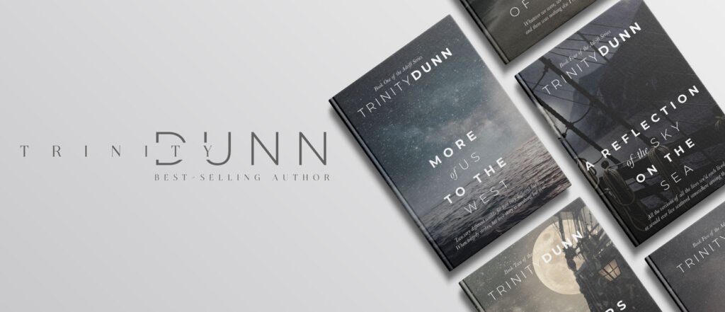
Logo & Colors
The logo was designed to be timeless yet contemporary, embodying Trinity’s literary voice. Rich, desaturated colors were chosen to evoke a sense of warmth and depth, while allowing book covers and imagery to take center stage. This ensured that visitors to the website would be drawn to Trinity’s captivating stories at first glance.
design
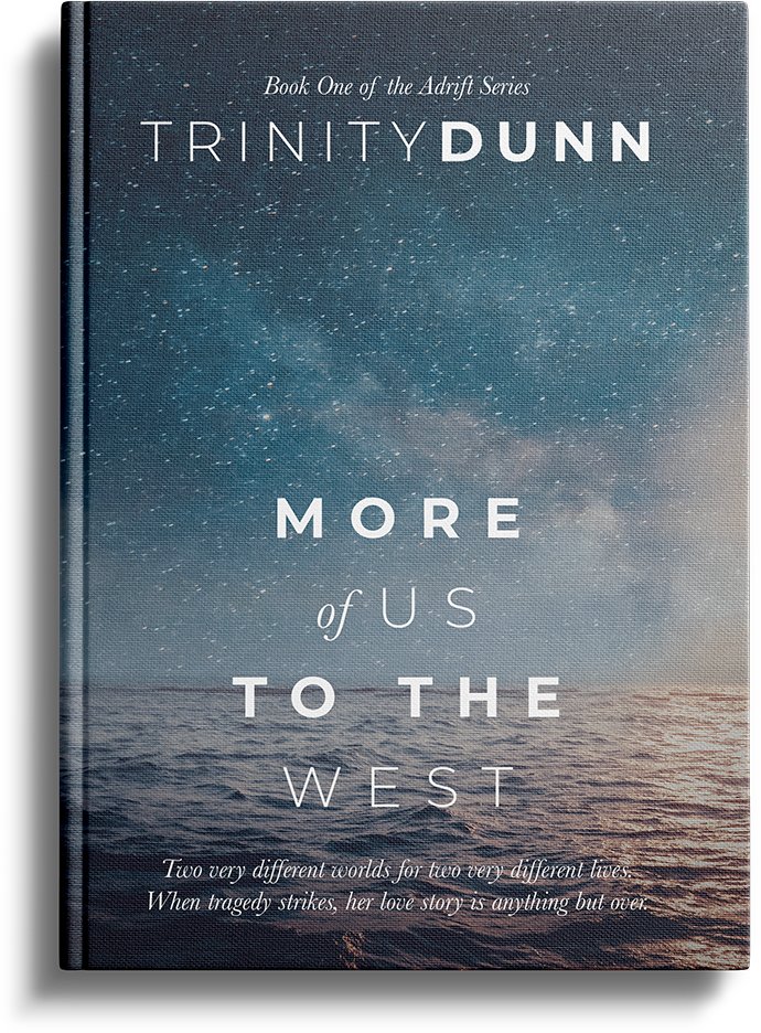
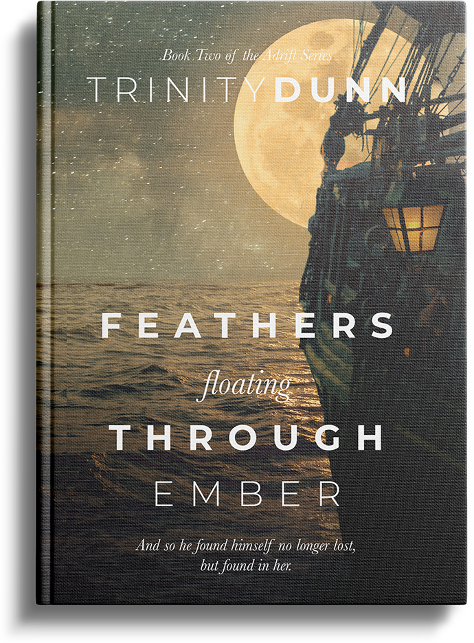
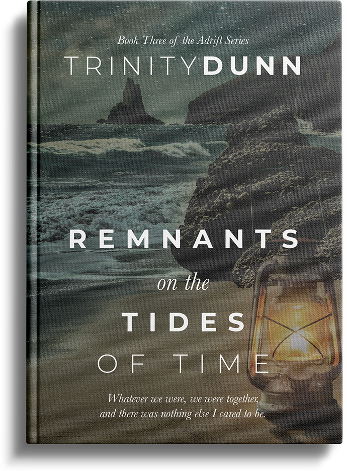
The Books.
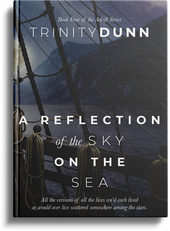
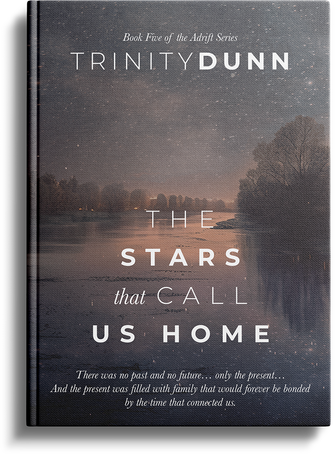
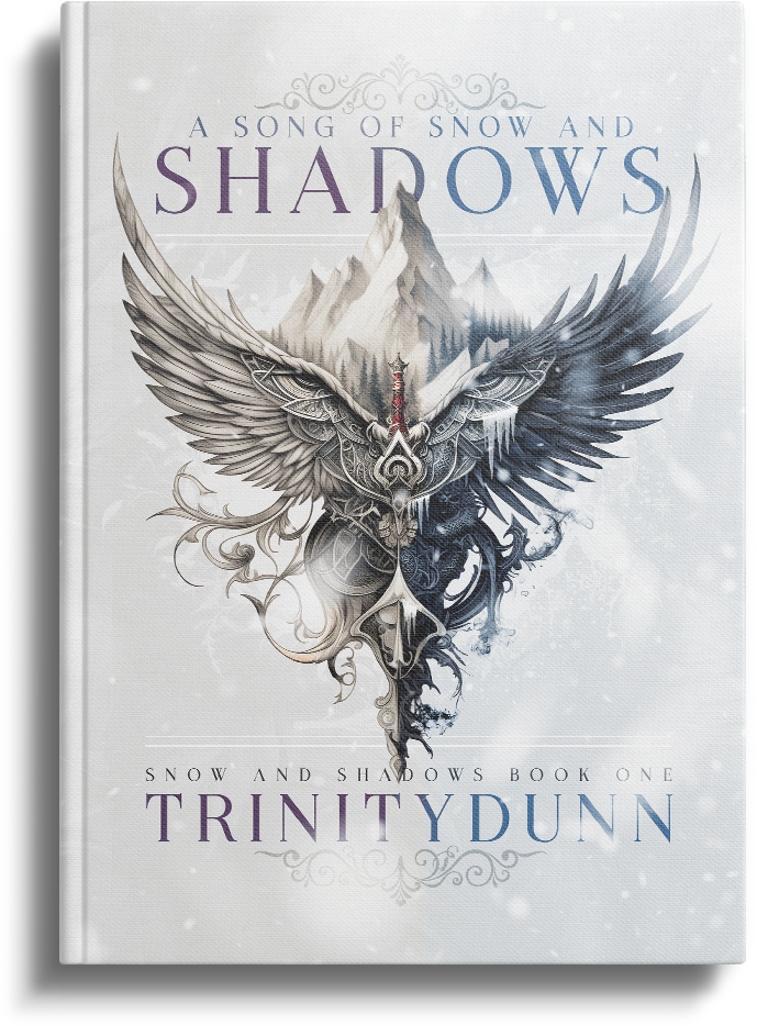
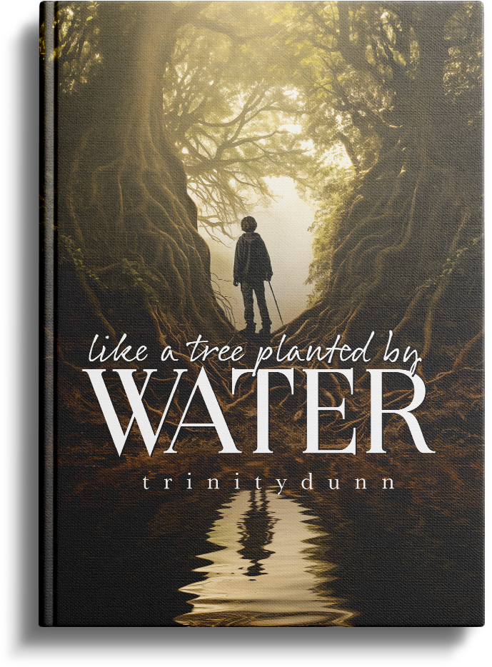
For Trinity’s 5-book Adrift series, we embraced a nautical theme, infusing each cover with imagery that transported readers to the high seas. “A Song of Snow and Shadows,” a fantasy romance, received a light, ethereal cover designed to stand out in its genre. “Like a Tree Planted by Water,” an Adrift origin story, was adorned with imagery that echoed its introspective themes.
development
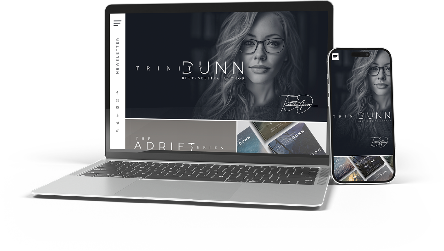
The Website.
The Experience
My goal was to create a website that reflects my versatility as an author who navigates through various genres, offering a clean, modern interface where content is not only accessible but easy to digest for visitors of all ages.
Understanding the importance of continuity for readers engrossed in series, I integrated tools designed to enrich their experience and anticipation for upcoming releases. This includes a Character Glossary and Series Recap pages, enhancing their engagement and comprehension of the story arcs. The inclusion of an “Ask the Author” feature fosters a deeper connection between me and my readers, encouraging social media interaction, participation in swag giveaways, and access to a comprehensive media kit.
Furthermore, the website showcases visually appealing landing page templates that highlight forthcoming books, crafted to captivate and encourage visitors to subscribe for updates, ensuring they remain engaged and eager for new releases.
Open graph templates
Recognizing the pivotal role of first impressions in digital sharing, I addressed the commonly overlooked aspect of open graph images. Rather than allowing social media platforms or messaging apps to arbitrarily select the first available image from a page or post, I established custom templates for my open graph imagery. This strategic move ensures that every share not only aligns with my new brand identity but also encapsulates the essence of the content in a visually appealing manner. By doing so, I’ve enhanced the likelihood of capturing attention and stimulating engagement with each share across text messages and social media platforms.
Dark/Light mode
After surveying customers within my target market, I discovered nearly 85% use Kindle’s auto-toggle feature for dark/light mode. A significant portion of my website traffic originates from Kindle’s back-of-the-book section, with over 70% of these clicks occurring post-9pm. This insight led me to hypothesize that readers might prefer viewing content in dark mode during the evening. Consequently, I implemented an automatic dark mode feature on my website, activating at 8pm. The results were remarkable: post-8pm page engagement surged, and notably, newsletter subscriptions tripled between 8pm and 11pm, underscoring the positive impact of aligning website user experience with audience habits.
results
The Results
For the website rebuild, I opted to continue utilizing WordPress for its ease of updating, yet shifted towards a headless configuration to meet Google’s stringent performance standards. The transformation brought about by the new branding has been remarkable, resulting in a 65% increase in user traffic and nearly doubling event participation. Impressively, the site now boasts a Lighthouse score of over 90, reflecting its enhanced performance and accessibility. This strategic overhaul has significantly boosted our organic search visibility, elevating us from the obscurity of pages 7 and 8 to the prominence of pages 1 and 2 for key search terms. Sales have surged by 30% following the update, and we’ve observed a 31% uptick in social media reach and engagement, marking a comprehensive triumph across all fronts.