Brand Identity, Graphic Design, UX Design, Audience Development
Mountain Billy
Country
United States
Industry
Firearms
Type
Full-engagement
Project Overview
This wasn’t just about design—it was about discipline. Mountain Billy Gun Lab came to me with a standout logo but no consistent system or structure beneath it. I led a full-scale branding strategy rooted in behavioral insights, competitive research, and persona-driven storytelling—elevating the brand from a gritty logo to a fully operational identity that speaks clearly and earns trust in a space where clarity is currency. The outcome? A foundation that equips Mountain Billy to scale, engage, and outlast.
Identity
Audience & Competitive Research
Before touching a color palette or font file, I dug deep into the behavioral profiles of Mountain Billy’s ideal users. Using social analytics, keyword searches, and a landscape audit of 20+ adjacent firearm and tactical brands, I uncovered a recurring theme: the people drawn to this space weren’t looking for hype—they were looking for honesty.
I built detailed audience archetypes rooted in real motivations: preparedness, protection, legacy, and function-over-flash. From off-grid dads and tactical moms to aging hunters and analytical preppers, each profile was layered with behavioral insights and media habits, shaping everything from tone of voice to design decisions.
Buyer Personas & Journey Maps
Six detailed personas were developed, each with unique psychological drivers, media touchpoints, and purchasing considerations. For each persona, I mapped multi-stage buyer journeys—from awareness to conversion to loyalty—offering campaign, content, and in-store strategy recommendations tailored to how these individuals think, train, and decide.
This insight didn’t just inform messaging; it guided structure—how Mountain Billy shows up, when they show up, and how they earn attention in crowded, trust-sensitive spaces.
Brand Voice & Positioning
We refined the Mountain Billy personality as the Outlaw Craftsman—bold but grounded, disciplined without ego, and always building with intent. This voice had to feel like a trusted range instructor or a seasoned gearhead—never preachy, never performative.
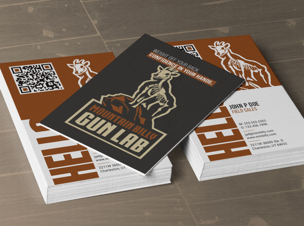
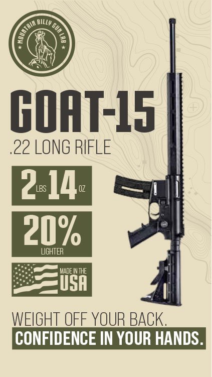
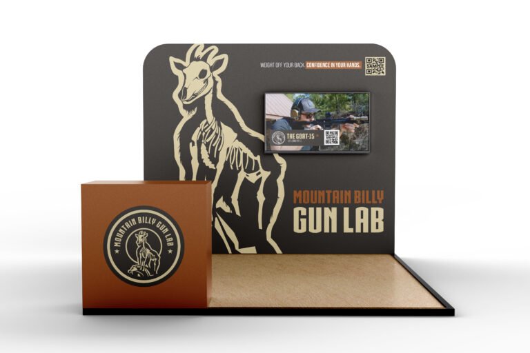
The brand’s new tagline—“Weight off your back. Confidence in your hands.”—emerged from this work, a distillation of the utility and trust buyers needed most.
Visual Identity & Guidelines
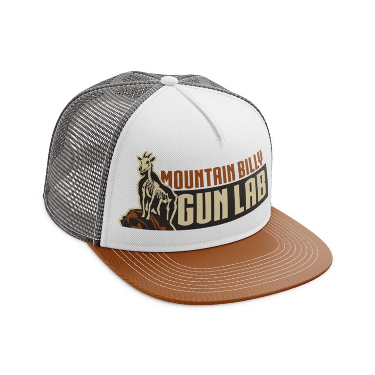
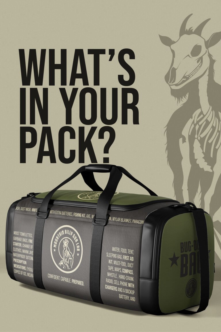
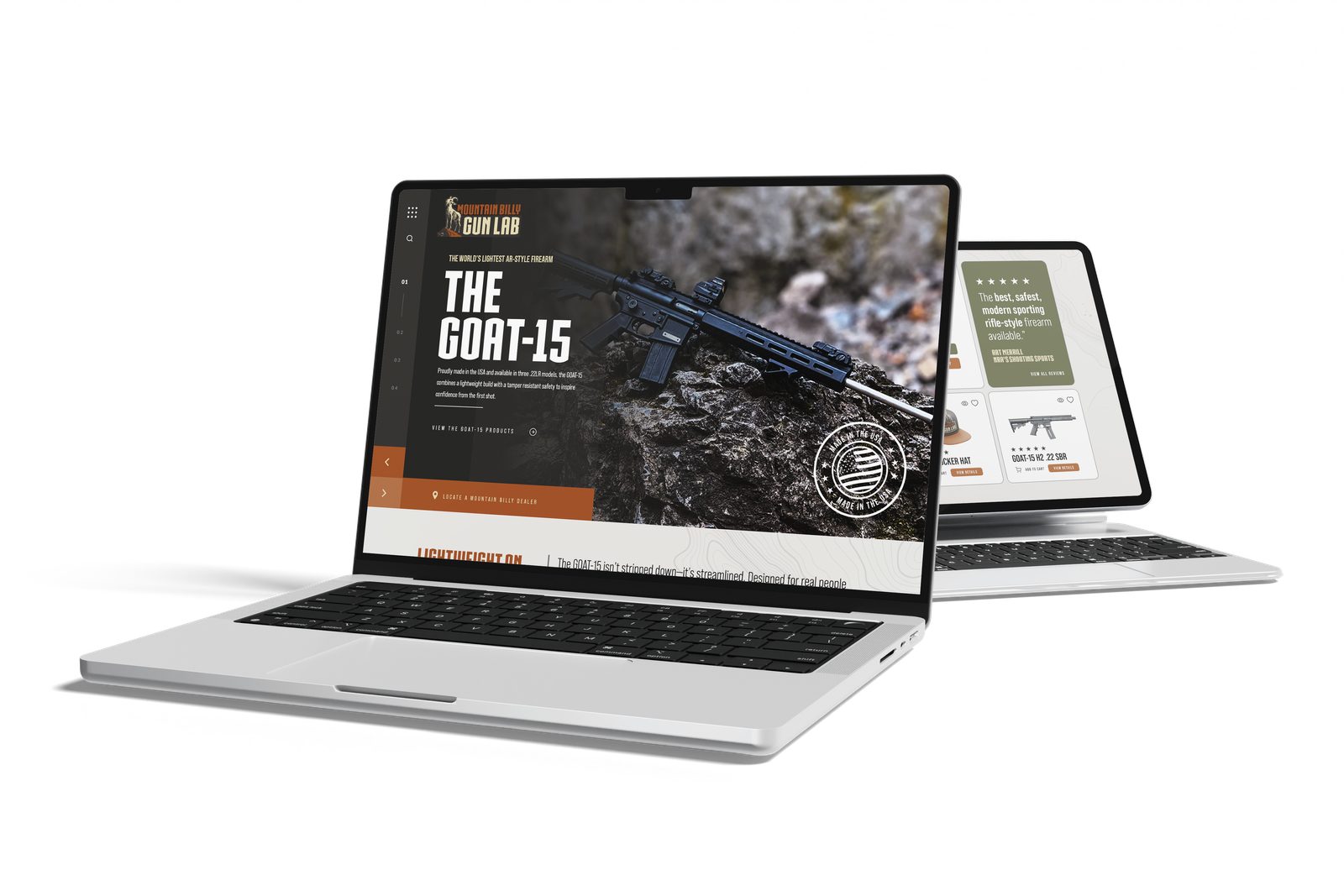
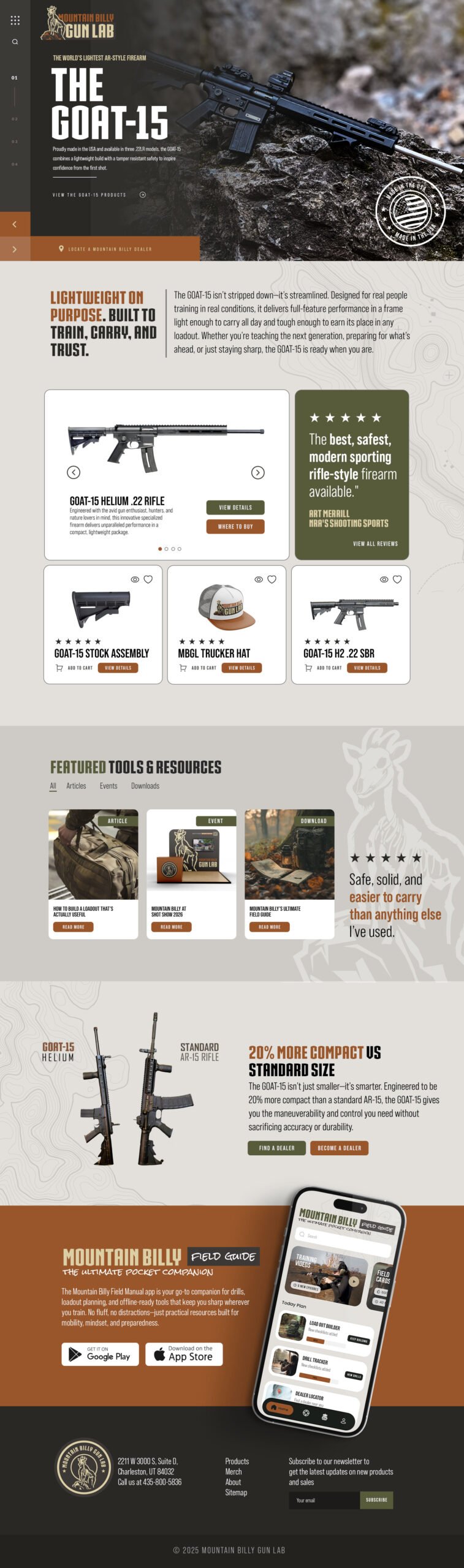
The existing logo already had grit and recognition, but the visual system lacked flexibility. I created a comprehensive brand identity playbook, including: Logo application rules, Color palette inspired by terrain and utility, Scalable typography for web, print, and field cards, Imagery guidelines that reflect use, not aesthetics, Iconography system organized by use-case (gear, audience, application)
This playbook now serves as the central tool for internal teams, dealers, and partners—ensuring brand alignment at every touchpoint.
design
brand usage
The guides also covered common usage instructions so the brand could remain consistent across a wide variety of applications