CMNH Concepts
Country
Industry
Type
The agency partnered briefly with the Cleveland Museum of Natural History, where my role involved a deep dive into understanding their diverse audiences and existing content. My objective was to devise a strategic website plan and a revamped content architecture that would resonate with the museum’s ambitious new construction goals. The overarching aim was to enrich the online and on-site experiences for each visitor, thereby boosting membership numbers and encouraging repeat visits. By aligning digital presence with physical enhancements, we sought to create a seamless, engaging journey that would draw more visitors, fostering a deeper connection with the museum and its offerings.
In the process of audience journey mapping, I meticulously categorized the Cleveland Museum of Natural History’s content—ranging from exhibits, research highlights, trip planning tools, events, educational materials, to the latest news—into segments tailored for distinct audience groups: families, educators, donors, researchers, and job seekers. This segmentation enabled me to craft specialized user journey models that delivered curated content designed to resonate deeply with each user type.
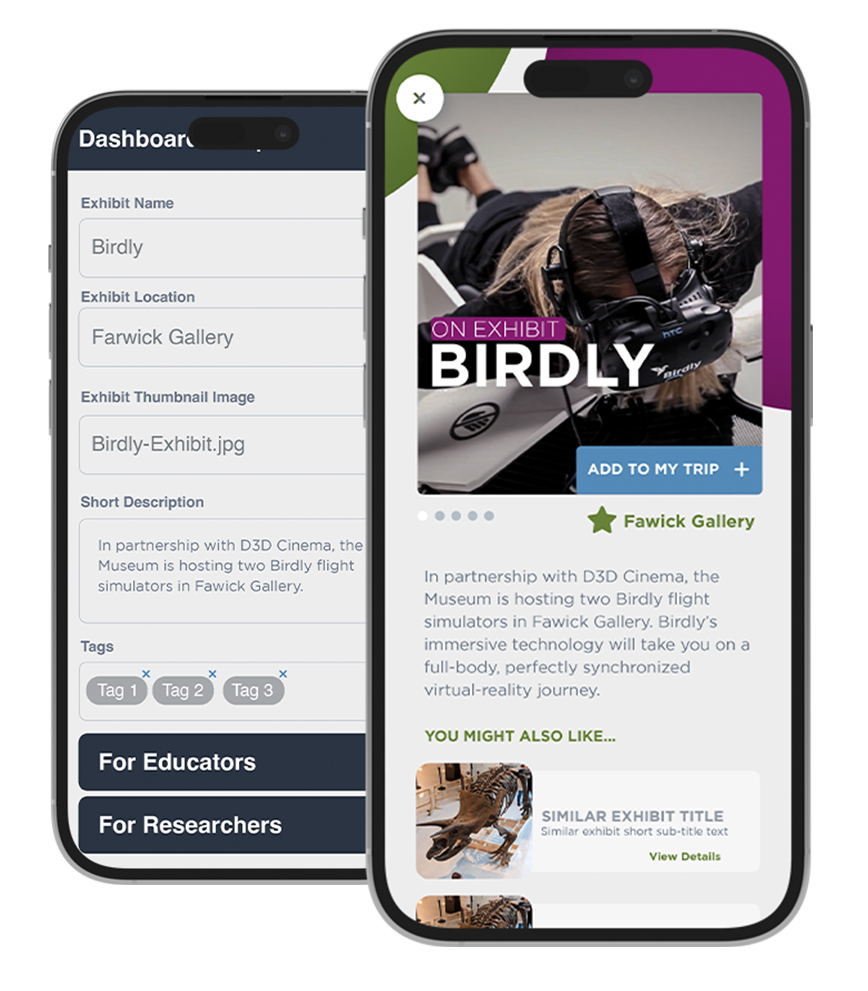
To refine this personalized approach further, we implemented click behavior and referral source rules, allowing us to accurately identify user types upon their initial interaction with the site. This data-driven strategy ensured that content relevancy was maximized from the outset. Building on this foundation, we employed location-based rules to transform the CMNH website experience akin to an app for visitors within the museum. This innovative feature aimed to enhance the physical visitation experience, making it more interactive, informative, and memorable for each visitor, thereby encouraging membership and frequent visits through a seamlessly integrated digital and physical journey.
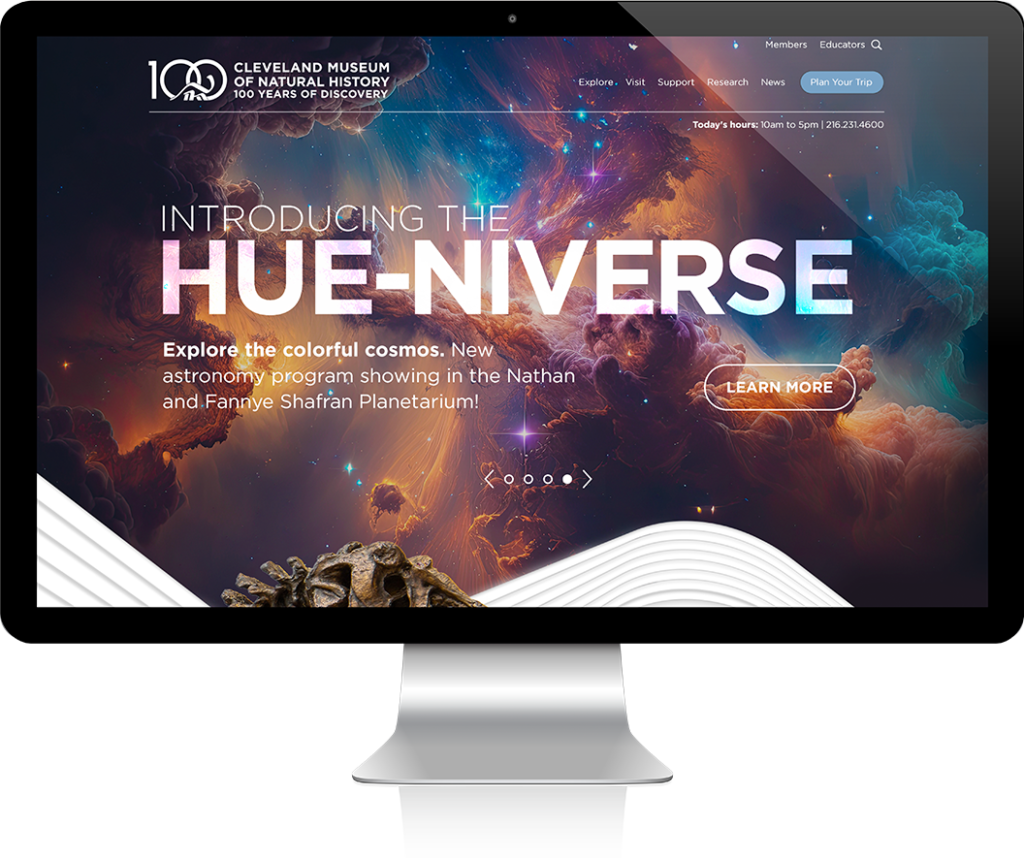
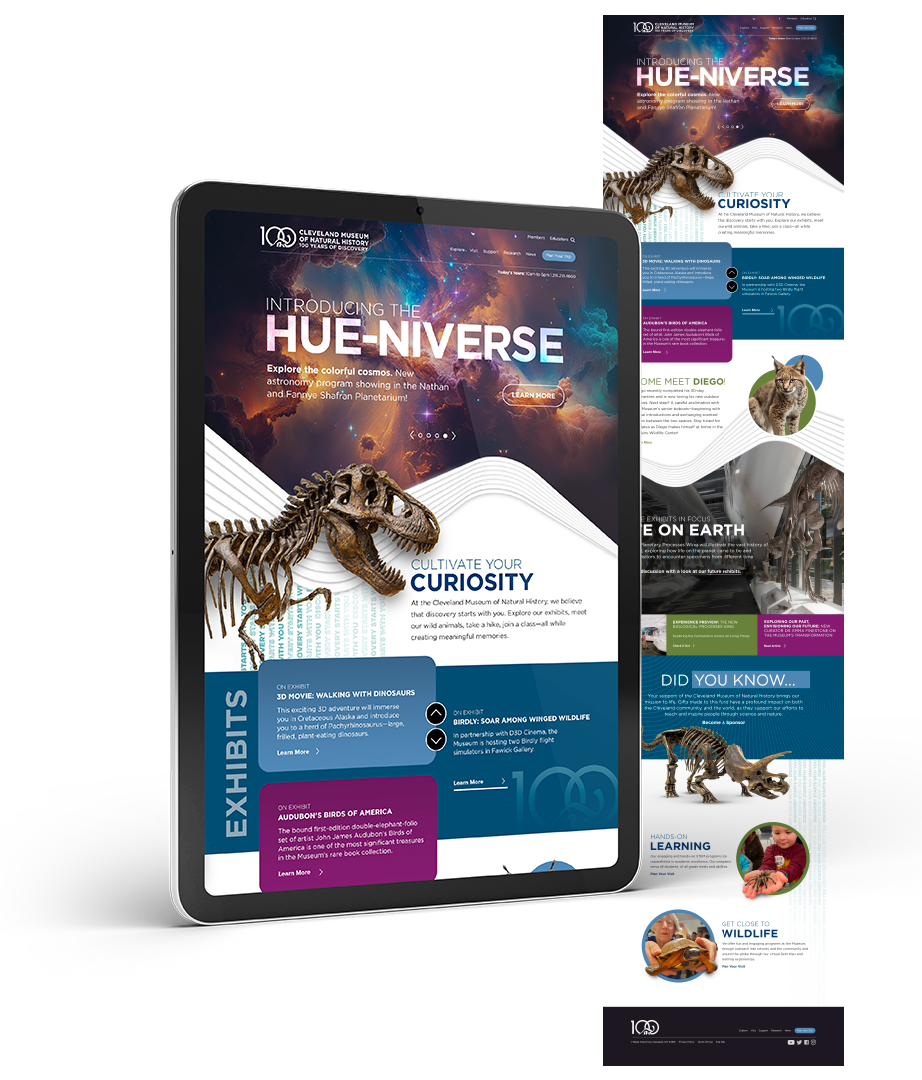
CMNH wanted to be seen as fun but still experts, appealing to several different audience types at once. In the first concept, I took a much more “fun” approach.
In this concept, my aim was to infuse the site with vibrant colors that would spotlight the museum’s featured exhibits, creating an immediate visual appeal for potential visitors. I employed animated cut-out imagery across the site to captivate users, adding a dynamic layer that encourages continuous scrolling and exploration. Recognizing the challenge of presenting a wealth of content to unidentified users, I meticulously organized the information into a scrolling layout that breaks down the museum’s offerings into more digestible segments. This approach not only simplifies navigation but also integrates the “plan your trip” feature prominently throughout the site, ensuring visitors can effortlessly start envisioning and organizing their visit at any point during their online journey.
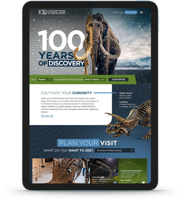
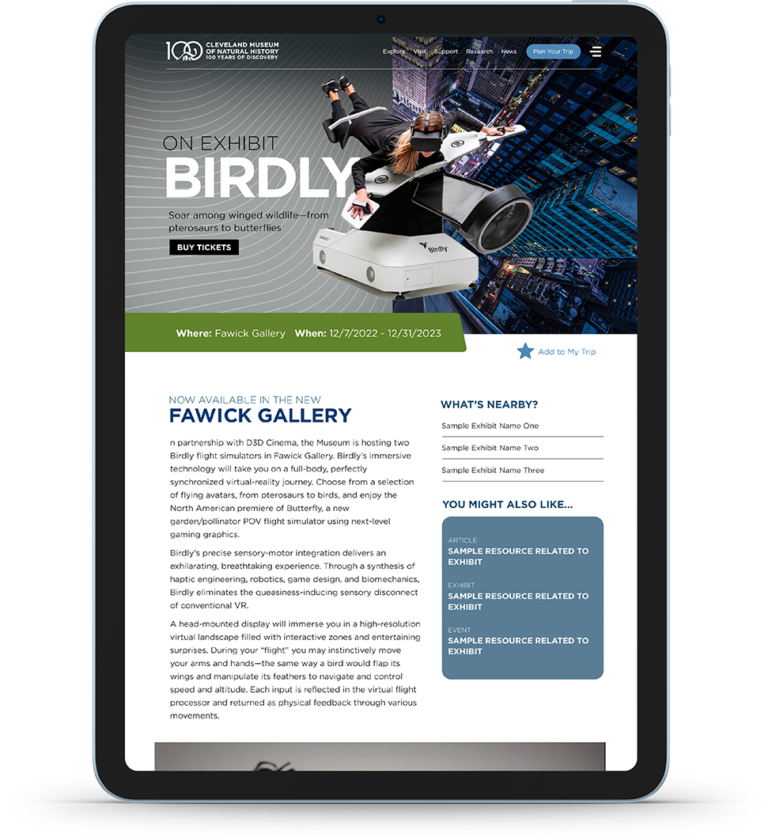
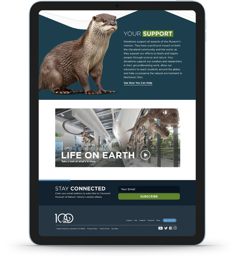
In this concept, our goal was to craft a website that not only serves as an informative platform but also as an engaging digital extension of the Cleveland Museum of Natural History. By strategically curating the user experience, we aimed to depict the museum as both a fun and educational destination, appealing to a diverse audience range.
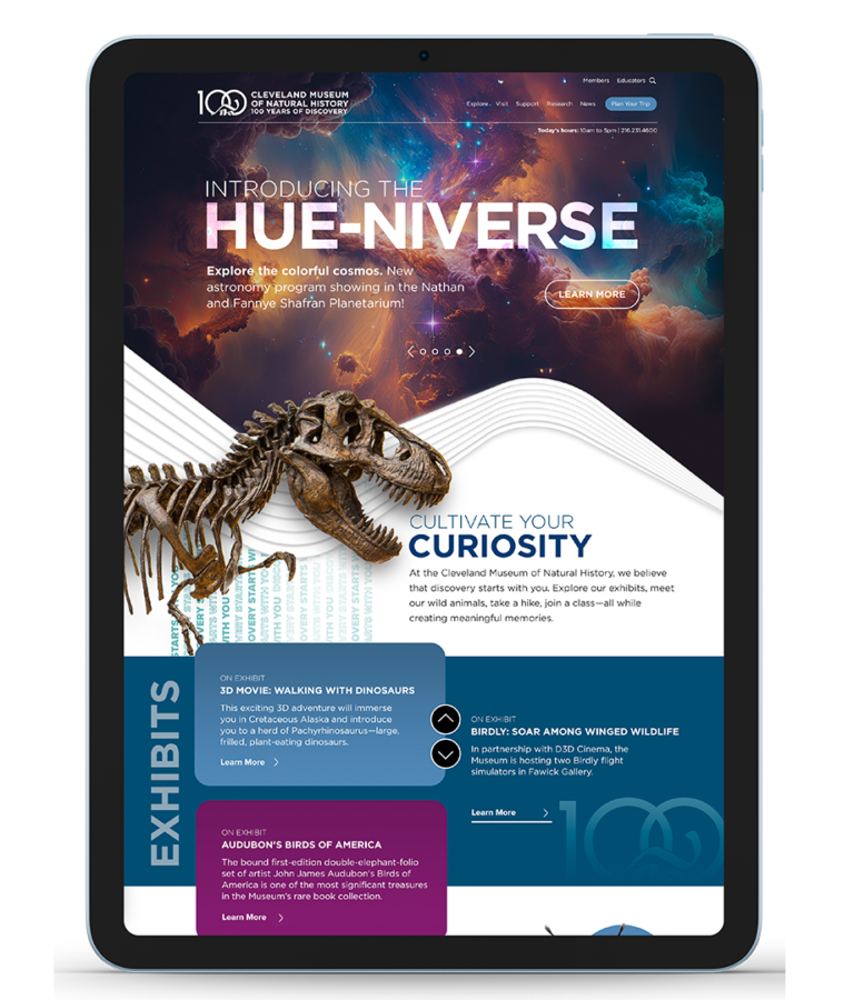
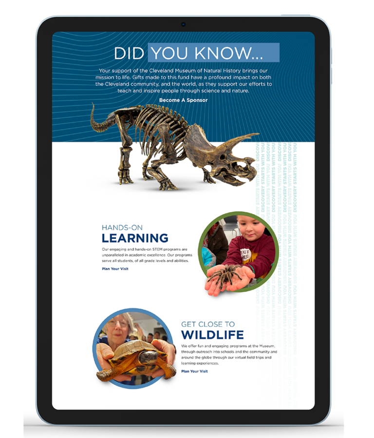
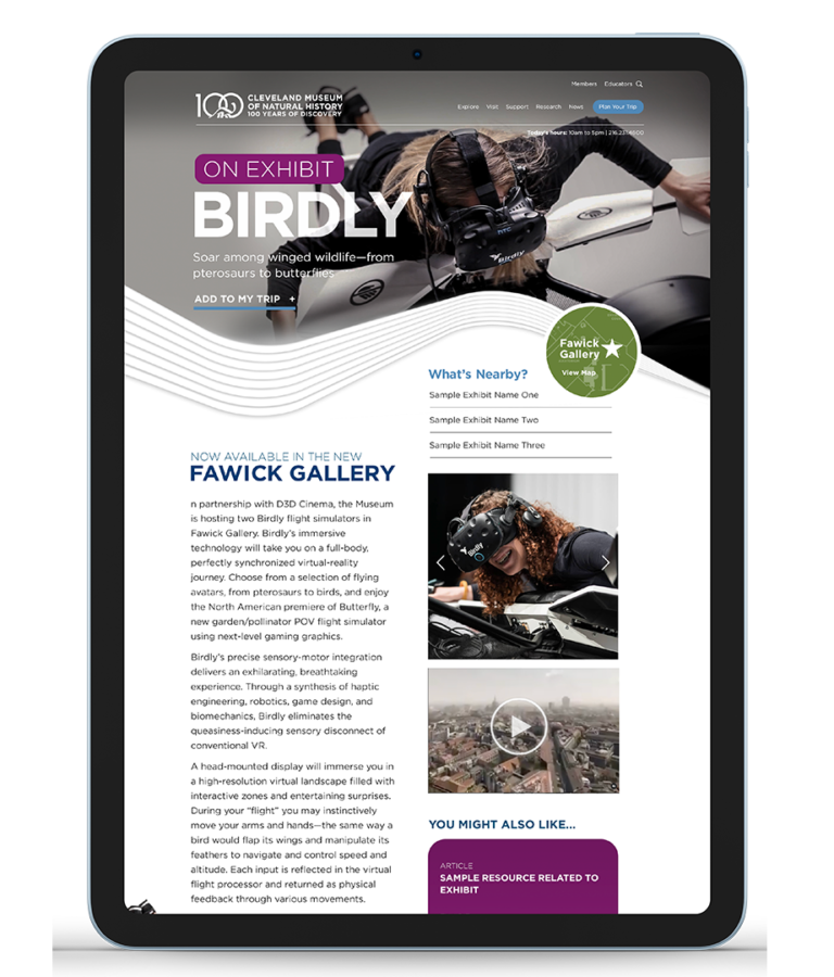
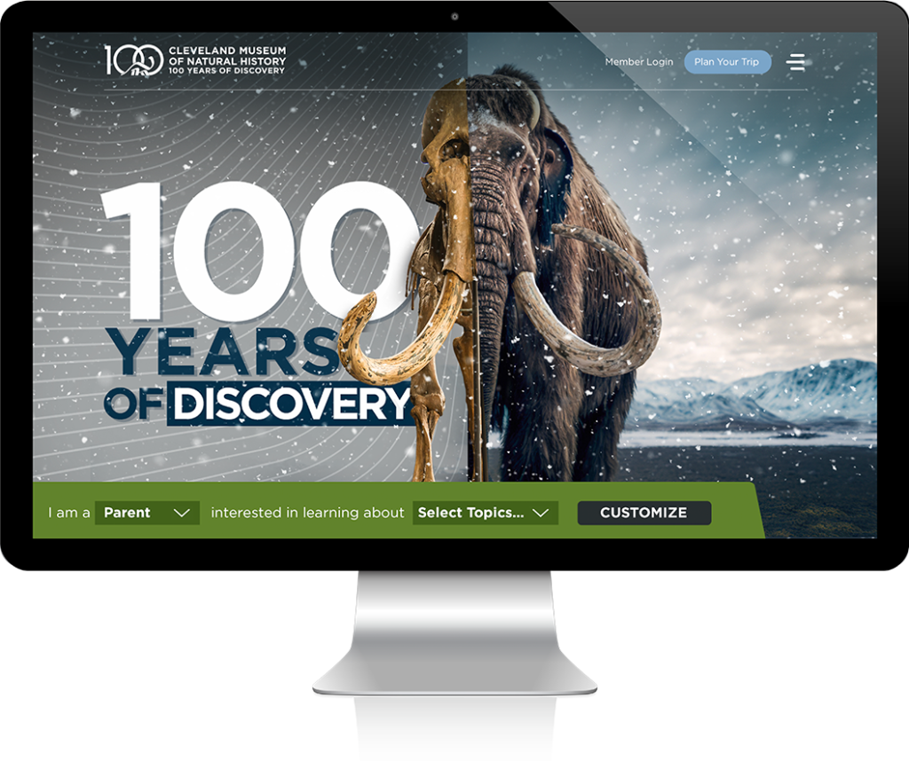
An experience-driven design to track & identify behaviors.
This design strategically emphasizes interactive engagement directly on the webpage, incorporating an array of “before/after” style reveal sliders. These sliders not only captivate users visually but also serve to underscore the transformative aspect of “natural history,” allowing users to interactively experience the evolution and change over time within various exhibits. To further tailor the website experience, a quick navigation feature was introduced at the outset, enabling users to personalize their journey. By selecting their audience type and interests, visitors are immediately presented with content and recommendations that align with their preferences, streamlining their engagement with the site.
In refining the design, this iteration maintains the visually appealing cutout imagery and wave patterns that echo the museum’s new architectural features, while placing a stronger emphasis on showcasing the historical and educational facets of the museum. This approach not only preserves the aesthetic continuity established by the new construction but also deepens the content’s educational impact.
