The Anti-Design Trend: Why It’s Everywhere Now
Once a fringe aesthetic relegated to underground zines and protest art, anti-design has gone mainstream. Brands are ditching symmetry, default fonts, and sterile minimalism for something that feels more raw, more real—and honestly, more human.
The reason? We’re burnt out on polish.
In a sea of beautifully optimized, pixel-perfect sameness, mess gets attention.
Think:
- Brutalist websites with jarring type
- Clashing colors and lo-fi textures
- Layouts that feel more like collage than grid
But make no mistake: the best examples aren’t lazy or careless. They’re intentional.
Why Some Brands Are Going “Ugly on Purpose”
This isn’t just visual rebellion—it’s a psychological shift.
Audiences, especially younger ones, are craving authenticity over aspiration. When everything feels overproduced and overly optimized, imperfection becomes a form of honesty. Brands like Liquid Death, MSCHF, and even newer Gen Z fashion labels are thriving on visuals that feel less “brand guidelines” and more “unfiltered thought dump”—and it works.
There’s behavioral science behind this, too.
We tend to trust what feels spontaneous, imperfect, and even a little ugly. It signals that a human was involved. That we’re not being marketed to. Even if… we absolutely are.
Case in Point: When It Works
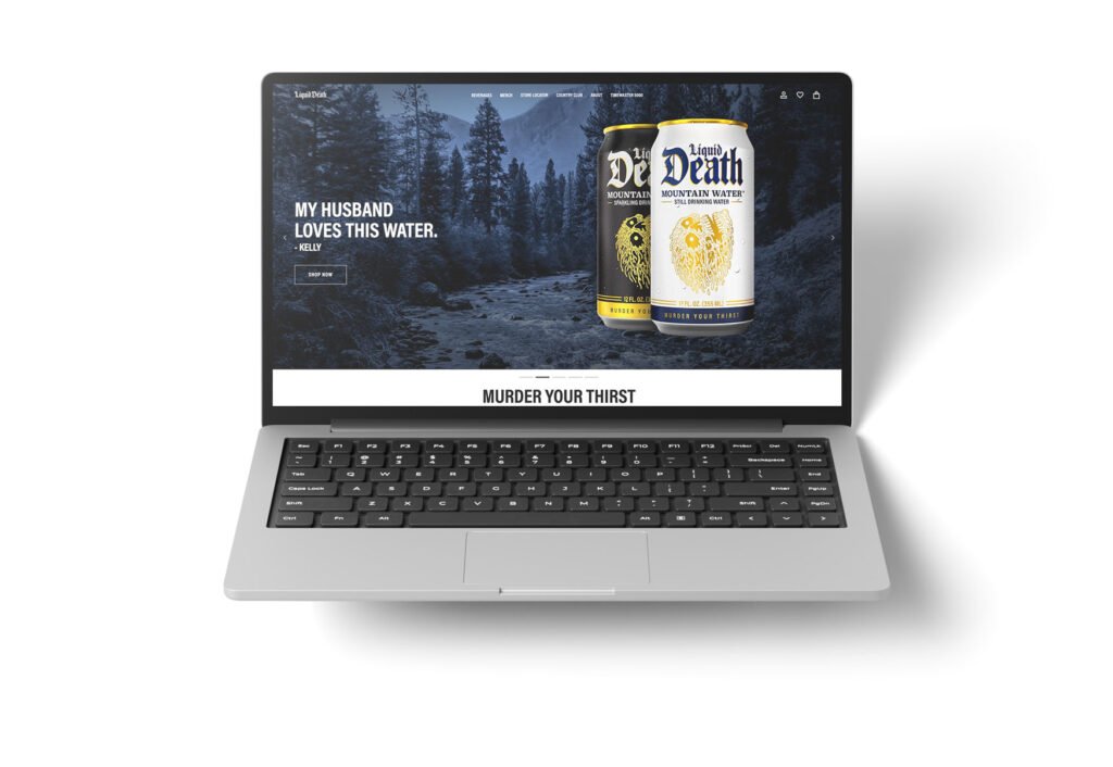
Take Liquid Death. Their visual language is loud, chaotic, and borderline grotesque—on purpose. Gothic fonts, lurid illustrations, high-contrast everything. But the experience? Surprisingly smooth. You always know what they sell, where to click, and how to check out. Their “ugly” is built on clean UX foundations. That’s intentional mess done right.
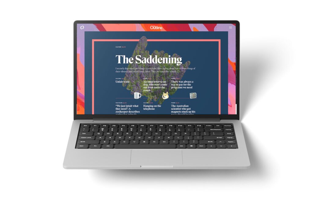
Then there’s The Outline, a now-defunct media brand that turned digital publishing on its head. Their site broke all the rules—gigantic headlines, asymmetrical layouts, overlapping elements, type that screamed at you. And yet… it worked. You could still scroll, read, and engage. The design amplified the editorial tone instead of fighting it.
That’s the difference.
Good anti-design provokes without punishing. It’s uncomfortable in a way that makes you lean in—not bounce out.
Compare that to a website that throws together clashing fonts, messy spacing, and no visual hierarchy just to feel “different.” That’s not rebellion—it’s confusion. The goal isn’t to abandon design principles. It’s to bend them with purpose.
How to Design “Ugly” Without Losing Strategy
If you want to dip into this aesthetic without sabotaging your brand, follow these guardrails:
1. Start with Purpose, Not Shock
- What emotion or reaction are you trying to evoke?
- Who is your audience—and are they in on the joke?
2. Break the Rules You Know Intimately
- Designers who use anti-grids still understand grids.
- Break hierarchy only if you can still guide attention through type, contrast, or motion.
3. Lean on Micro-Structure
- Even the most chaotic layouts need rhythm: repetition, intentional whitespace, typographic consistency.
- Don’t abandon UX. Anchor your “mess” in clarity.
4. Use Discomfort Strategically
- Asymmetry, color clash, and jarring elements can spark curiosity—but only when surrounded by something familiar.
- Let one element get wild while others stay clean.
Trend Forecast: The New Minimalism Is Maximalist
We’re watching a pendulum swing.
For a decade, brands chased pristine minimalism. Now, the trend is tipping the other way—not toward noise for noise’s sake, but toward intentional friction. Visual language that mirrors the chaos of life, the energy of rebellion, the emotion of being real.
And it’s not just visual.
This rawness is spreading into brand voice, motion, and even sound design—subtle distortions, type that jitters, transitions that feel more “scroll jam” than slide deck.
Final Thoughts: Design With Guts, Not Just Grids
The best anti-design isn’t about rejecting design—it’s about expanding it.
It’s about making space for human messiness in a medium that’s been over-filtered and algorithmically flattened.
So go ahead:
Use that ugly font. Break the grid. Add noise.
Just make sure it still makes people feel something—and do something.
Because in the end, good design isn’t just about how it looks.
It’s about how it moves people. Even if that means shaking things up a little.