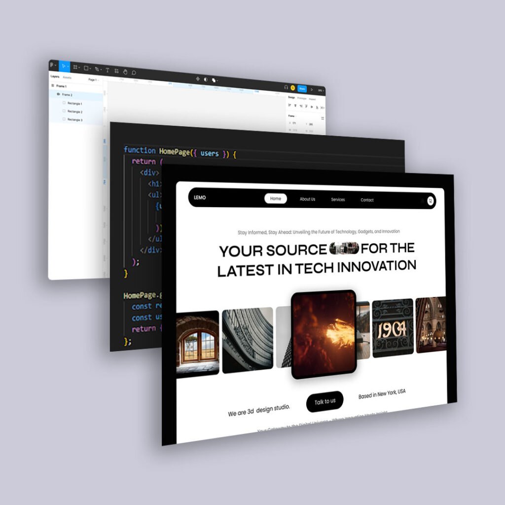
Web design trends come and go. But clarity, scalability, and legibility? Those never go out of style.
As devices diversify and AI-driven interfaces change how content is delivered and repackaged, designing flexible, system-based experiences isn’t just smart—it’s necessary. If you want your UX to last into 2025 and beyond, start with your foundation: typography and spacing. Here’s how to build scalable, behavior-friendly design systems that respond beautifully across breakpoints, devices, and even emerging AI interfaces.1. Use Fluid Typography with Clamp() for Dynamic Sizing
Fluid type ensures your text grows (or shrinks) based on the screen size. Instead of using media queries for every device, useclamp() to define a scalable range:
font-size: clamp(1rem, 1vw + 0.5rem, 1.5rem);
Why it works:
Legible at every screen size
Respects user preferences
Makes your content more adaptable to responsive containers (and AI-read interfaces like SGE or ChatGPT summaries)
2. Create a Type Scale and Stick to It
Design tokens or utility classes can define heading and body sizes using a modular scale:
					$font-size-base: 1rem;
$scale: 1.25;

h1 { font-size: $font-size-base * $scale * $scale * $scale; }
h2 { font-size: $font-size-base * $scale * $scale; }
h3 { font-size: $font-size-base * $scale; }
Benefits:
Faster dev handoffs
More consistent layout
Easier to maintain or scale across brands
3. Adopt a Spacing System Based on 4, 8, or 10px Increments
Stop using one-off pixel guesses. Instead, define your spacing system as tokens or variables:
					$space-xxs: 4px;
$space-xs: 8px;
$space-sm: 12px;
$space-md: 16px;
$space-lg: 24px;
$space-xl: 32px;
This helps with:
Layout rhythm
Predictable vertical spacing
Scalable UI kits (especially for design systems shared across platforms)
4. Use CSS Variables to Build Design Tokens
Tokens make your styles more reusable and consistent. Example:
					:root {
  --font-body: 'Inter', sans-serif;
  --font-heading: 'Merriweather', serif;
  --spacing-unit: 8px;
  --radius-sm: 4px;
  --radius-lg: 12px;
}
In your components:
					.card {
  padding: var(--spacing-unit);
  border-radius: var(--radius-sm);
}
5. Design for Line Length and Vertical Rhythm
It’s not just about type size. It’s about reading comfort.
Keep line length between 50–75 characters
Use
line-height: 1.4 – 1.6for body textAdd consistent vertical spacing between paragraphs, headers, and blocks
Well-spaced content reads better—and is easier for AI to parse and summarize meaningfully.
6. Don’t Let AI Interfaces Break Your Layout
As platforms like Google SGE and ChatGPT summarize and reformat your content:
Structured HTML helps preserve content hierarchy
Flexible spacing keeps UI readable across embeds or previews
Semantic typography signals importance and relevance
Final Thoughts
Typography and spacing are often treated as aesthetic decisions. But they’re behavioral ones. They shape scannability, comprehension, and trust.
When you systemize your design, you’re not just making dev easier. You’re making content more resilient.
And in a world of adaptive interfaces and AI-powered delivery, resilience is everything.