Most teams don’t lose time because anyone can’t do their job. They lose time in the gaps between jobs.
Dev asks whether the “card” is a reusable component or a one-off. Design says it’s a component, but the file has three slightly different paddings. Someone realizes the mobile layout wasn’t actually defined, so the dev makes a call, then gets a revision request. Meanwhile, half the conversation is about tiny stuff that shouldn’t require a meeting: spacing scale, type styles, hover states, error states, and what “responsive” is supposed to mean on this screen.
AI can remove a big chunk of that back-and-forth, but only if you set it up to translate your design system into code instead of guessing from a screenshot. This workflow shows exactly how to do that in Next.js.
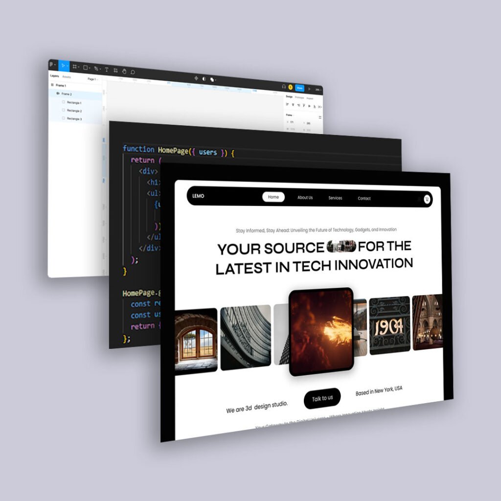
Step 1: Design in Figma like you plan to ship it
This starts the minute you open a new frame. If you want AI to generate code you’ll keep, you need a file that behaves like a system, not a poster.
Use tokens on purpose
Before you design the screen, lock these:
- A spacing scale (example: 8 / 12 / 16 / 24 / 32 / 48)
- A type scale (H1/H2/H3/body/small)
- Color roles (primary, surface, text, muted, border, danger)
If your Figma frame uses random spacing and custom font sizes, your generated code will too.
Build with components, not duplicated frames
At minimum, build and reuse:
- Button (variants, sizes, states)
- Input/select/textarea (label, help, error)
- Card
- Badge/tag
- Nav (if it exists)
AI is far better at assembling known pieces than inventing consistent structure.
Use Auto Layout for real layout
If the layout is “manually positioned,” AI has to infer responsiveness. If it’s Auto Layout, the intent is baked in:
- Sections stack vertically with consistent gaps
- Cards are content stacks with an actions footer
- Buttons hug content and keep consistent padding
- Grids are actual grids, not eyeballed columns
Name layers like they’re going to become code
Rename Frame 132 into something that maps cleanly:
PricingSectionPlanCardPlanFeaturesPrimaryCTAMostPopularBadge
This reduces how often the AI produces generic div soup.
Design at least one set of real states
Include these on the frame (even off to the side):
- Hover + focus (especially buttons/links)
- Empty/error state (if there’s a form or data)
- Long copy and short copy example
If you don’t show states, the AI will invent them, and you’ll spend time correcting inventions.
Step 2: Create a “build packet” from the Figma frame
This is the fastest way to get real “how-to” value from AI. You are going to hand the AI a small, factual spec so it stops freelancing.
Paste this template into a note (or keep it in your repo as docs/build-packets/...):
Build packet (copy/paste)
- Figma frame(s):
PricingPage / PricingSection - Breakpoints: mobile-first;
md=768,lg=1024(adjust to your system) - Layout rules:
- Mobile: plan cards stack, full width
- Desktop: 3-column grid, equal-height cards
- “Most popular” plan: badge + emphasized border + primary CTA
- Tokens:
- Spacing: 8/12/16/24/32/48
- Radius: 12
- Type: H2=32, body=16, small=14
- Component targets (do not invent new primitives):
Button,Card,Badge,Container(and your form components if needed)
- Accessibility:
- Proper heading order
- Buttons are
<button>, links are<a> - Visible focus styles
This packet is the difference between “generate some UI” and “generate our UI.”
Step 3: Set up your AI coding tool so it follows your codebase rules
When I say “in your editor,” I mean the tool where you actually code: Cursor, VS Code + GitHub Copilot, Windsurf, etc. You want AI working where it can create files, refactor, and keep changes reviewable.
Create a project rules file (one-time setup)
Add docs/ai-front-end-rules.md (or similar). Keep it short and strict:
AI Front-End Rules (copy/paste)
- Next.js App Router, TypeScript.
- Prefer server components by default; use
"use client"only when needed. - Use existing UI primitives (
Button,Card,Badge,Input, etc.). Do not create replacements. - No hardcoded hex colors. Use theme tokens/CSS variables.
- No magic spacing values. Use the spacing scale.
- Mobile-first responsiveness. Add breakpoints intentionally.
- Semantic HTML only. Keep DOM shallow.
- Accessibility is required: labels, focus, keyboard behavior, error messaging.
Then in Cursor/Copilot/Windsurf, you can keep prompting: “Follow docs/ai-front-end-rules.md.”
Step 4: Generate the Next.js component scaffold first
Do not ask AI to generate the entire page in one go. You’ll get one giant blob that’s painful to fix.
Start with structure.
Example target file tree
For a single section (Pricing), a clean outcome looks like this:
					app/
  pricing/
    page.tsx
components/
  pricing/
    PricingSection.tsx
    PlanGrid.tsx
    PlanCard.tsx
    PlanFeatures.tsx
lib/
  pricing/
    plans.ts
Prompt 1: file scaffold + component boundaries
Paste your build packet, then prompt:
Create the file structure above. Implement
PricingSection,PlanGrid,PlanCard, andPlanFeatures. Followdocs/ai-front-end-rules.md. Use our existingButton,Card, andBadgecomponents. Do not invent new primitives. Use placeholder data inlib/pricing/plans.ts.
This should give you a readable baseline.
Step 5: Implement layout rules in a second pass
Now you tell the AI exactly how it should behave across breakpoints.
Prompt 2: layout + responsiveness (no styling freelancing)
Implement the layout rules from the build packet. Mobile stacks cards. Desktop uses a 3-column grid with equal-height cards. Keep spacing on the defined scale. Keep DOM shallow and semantic.
If you use Tailwind, this is where Tailwind shines because the AI can express layout without inventing CSS architecture. If you use CSS Modules, the prompt still works, but you’ll want a follow-up prompt to consolidate class names.
Step 6: Force token compliance and remove “magic numbers”
AI loves to sprinkle mt-5 and gap-[18px] and random hex codes. You need one cleanup pass that exists specifically to delete that behavior.
Prompt 3: token cleanup
Replace any hardcoded colors with our theme tokens/CSS variables. Replace any spacing values not in the spacing scale. Remove any arbitrary font sizes and use the type scale.
This prompt is where you usually “get time back,” because token cleanup is repetitive and AI is good at repetitive work when you tell it what “correct” means.
Step 7: Implement states like a product team, not a screenshot team
This is where most codegen tools fall apart. They output the default state only, then the first time your UI hits reality, you’re back in redesign territory.
Prompt 4: “Most popular” + hover/focus states
Implement the “Most popular” plan styling and behavior from the build packet. Add consistent hover and focus states for interactive elements. Ensure focus is visible and meets accessibility expectations.
If your design system defines these states already, tell the AI to use them rather than inventing new ones.
Step 8: Do the refactor pass that prevents div soup
Even good AI scaffolding tends to repeat markup. The fix is a deliberate refactor pass.
Prompt 5: refactor + semantics audit
Refactor repeated markup into reusable subcomponents where appropriate. Ensure headings use correct levels, feature lists use
<ul><li>, and buttons/links use correct elements. Remove unnecessary wrapper divs.
If your output is going to be maintainable, this step matters as much as the initial generation.
Step 9: Your human QA pass (the part AI can’t responsibly do for you)
This is the “ship it” checklist. It’s quick, but it’s the difference between “fast” and “fast plus correct.”
- Resize: mobile → tablet → desktop. Confirm layout rules match the build packet.
- Swap content: long plan names, long feature bullets. Confirm nothing breaks.
- Keyboard test: tab through, confirm visible focus and logical order.
- Semantics: headings and lists are real elements.
- Tokens: no random hex values, no weird spacing numbers.
If you only do one manual thing, do the QA. It prevents the “we saved time and then lost it all” cycle.
A realistic expectation for “AI-generated front end”
If you follow the sequence above, you can usually get to:
- 70–85% of the UI implemented (structure, layout, responsiveness, tokens)
- with a human doing the final pass (states, edge cases, polish, QA)
That’s the sweet spot. You are not trying to eliminate development. You’re trying to eliminate translation churn.