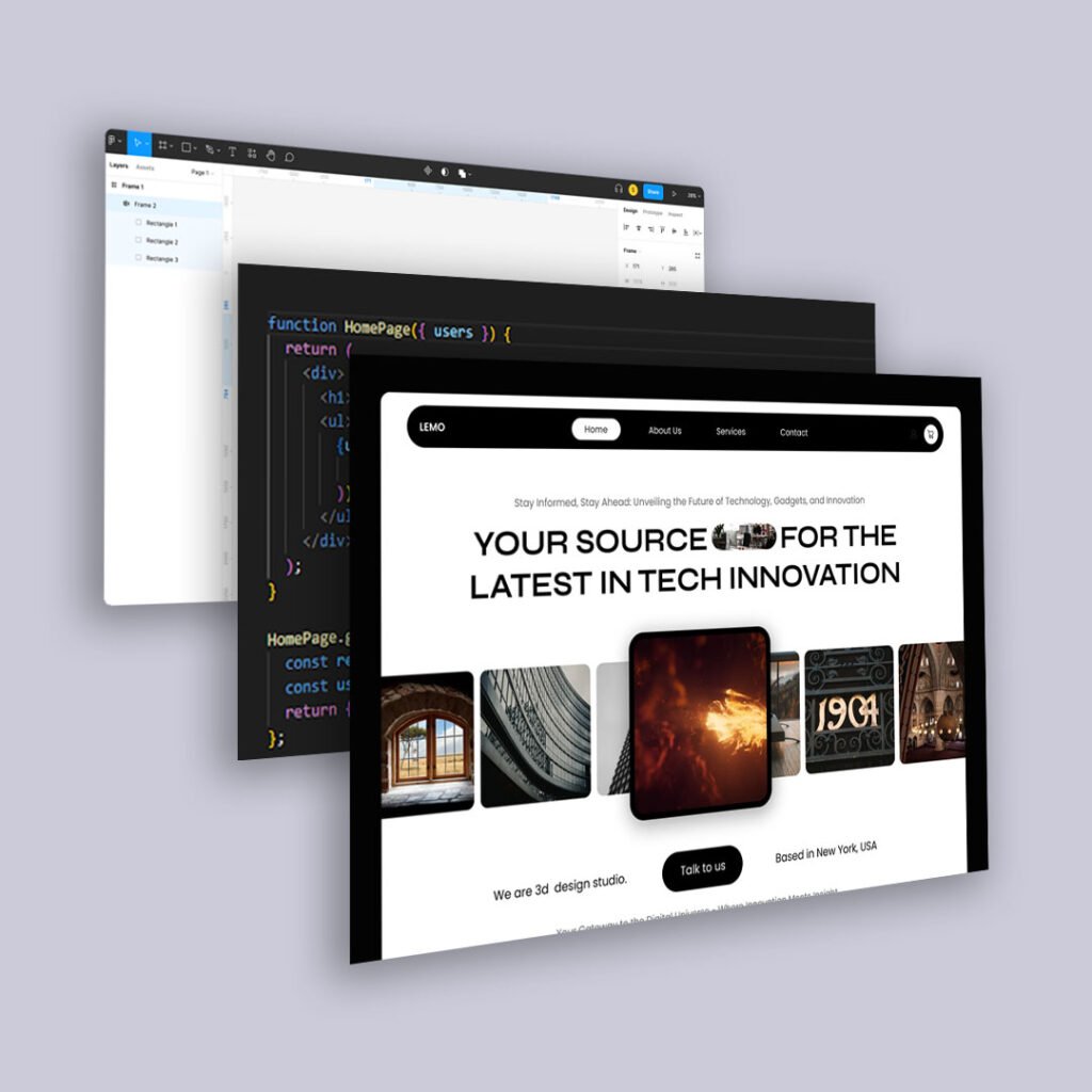
Why Landing Page Testing Matters
Your landing page is often the first impression. And first impressions don’t just convert—or don’t. They inform everything that comes next:
- How users perceive your brand
- What value they believe you offer
- Whether they feel understood or dismissed
- How quickly they act (or abandon)
- Testing lets you see what’s working—and more importantly, why.
But only if you do it right.
Step 1: Start With a Hypothesis (Not Just a Hunch)
Don’t test just because you “feel like something’s off.”
Start by identifying a specific user behavior or drop-off pattern. Then form a testable hypothesis like:
- “If we make the CTA more specific, more users will click.”
- “If we remove the form field asking for a phone number, completion rate will rise.”
- “If we add testimonials near the pricing section, bounce rate will drop.”
This keeps your test focused and measurable.
Step 2: Change ONE Thing at a Time
The golden rule of A/B testing: isolate the variable.
Common variables to test:
- CTA language (“Get Started” vs. “Try It Free”)
- Page layout or flow
- Headline phrasing
- Visual hierarchy
- Trust elements (badges, testimonials, security signals)
- Form field count
- Hero image or background video
If you change too much at once, you won’t know what caused the difference.
Step 3: Let the Test Run Long Enough (And Wide Enough)
You need a meaningful sample size before calling a winner.
Best practices:
- Run tests for at least 1–2 full user cycles (especially if you have weekly spikes)
- Aim for statistical significance, not just “better numbers”
- Use tools like Google Optimize, VWO, or Convert for reliability
Avoid ending tests early—short-term lifts can be misleading.
Step 4: Look Beyond the Conversion Metric
Yes, the goal is usually conversion. But behavioral signals often tell a more complete story:
- Scroll depth
- Time on page
- Click maps and cursor behavior
- Where users hover vs. where they click
- Rage clicks or rapid back-buttoning
These signals reveal friction—even when the numbers look “fine.”
Step 5: Don’t Just Declare a Winner—Learn From It
The goal of testing isn’t just a bump in performance. It’s learning what your audience responds to.
Ask:
- What did this result tell us about user intent or motivation?
- What friction did we remove (or accidentally add)?
- Can this insight apply to other pages or touchpoints?
Use testing as a behavioral insight engine, not just a scoreboard.
Final Thought
Great landing page testing isn’t about luck or volume.
It’s about intentional experimentation and interpreting behavior.
The best marketers treat every test like a conversation:
One version speaks louder—and the audience always answers.


