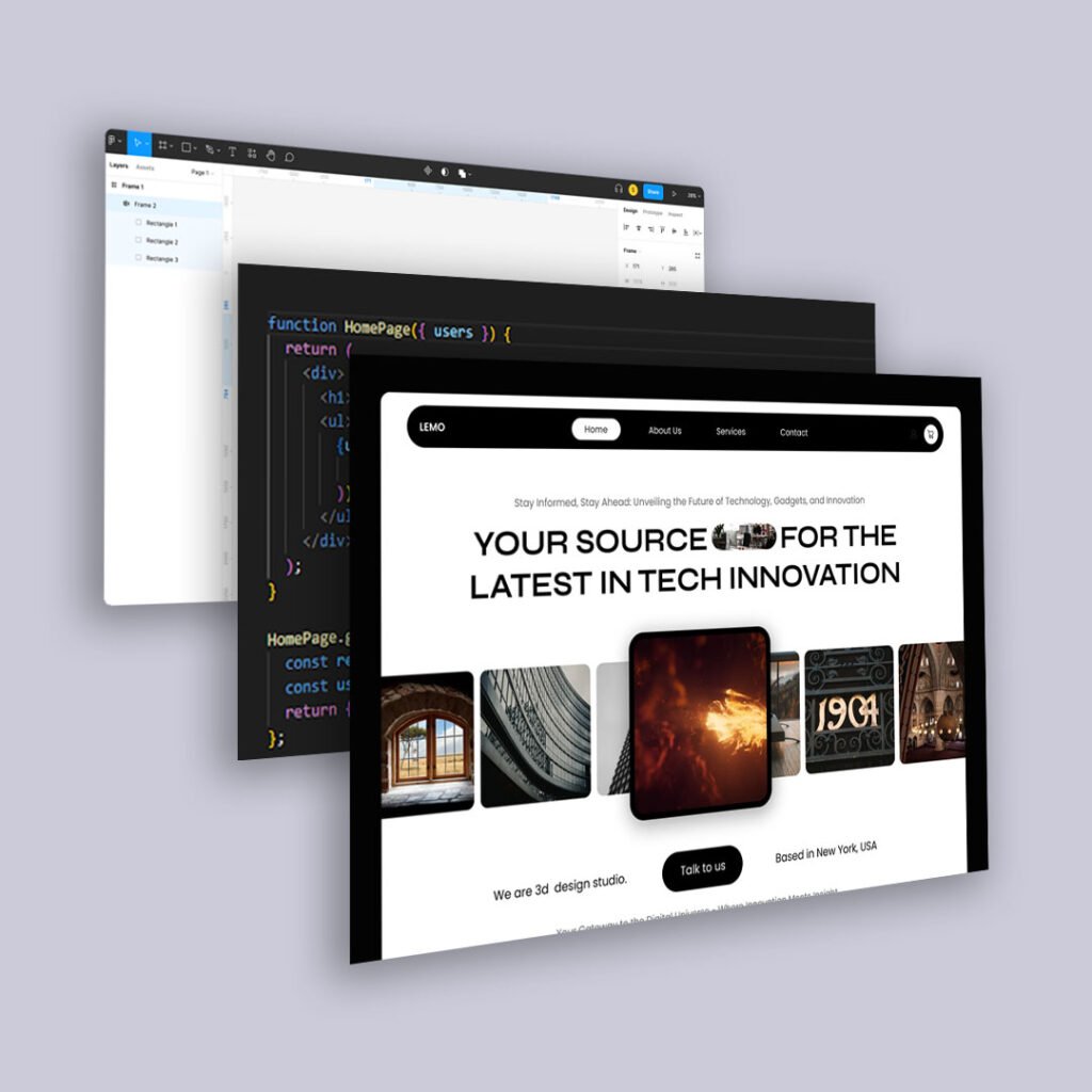
Start with Navigation: Clear Paths Make a Huge Difference
One of the most common sources of frustration on a website is disorganized or unclear navigation. When users don’t know where to go—or worse, they end up in a loop of dead ends—they’re likely to bounce. Simplify your main menu by grouping content logically, using intuitive labels, and eliminating unnecessary clicks. If it takes more than two or three steps to reach your most important pages, it’s time to reconsider your structure.
Improve Readability and Layout for Better Content Flow
Good UX starts with good communication. This means using fonts that are easy to read, keeping paragraphs short and well-spaced, and using headings to break up dense information. Visual hierarchy also plays a big role—highlight what matters most and guide the eye naturally down the page. If your site looks like a wall of text, readers will leave before they ever get to the point.
Make Every Call to Action Feel Natural and Clear
You don’t have to be pushy to guide someone toward action. Whether it’s a button to schedule a consultation, a link to learn more, or a prompt to sign up for your newsletter, your calls to action should feel timely, helpful, and relevant to the content around them. Avoid vague phrases like “Click here” and instead use copy that reflects what the user is about to do or receive.
Speed and Performance Are Part of UX
Many people overlook technical performance when thinking about user experience, but slow load times can make even the best-designed websites feel broken. Optimize images, minimize the use of bloated plugins, and consider a performance audit to improve speed. Google’s Core Web Vitals can be a useful guide for what to prioritize.
Watch Real Behavior, Not Just Best Practices
It’s easy to get stuck in a theoretical idea of good UX, but nothing beats observing how people actually use your site. Use tools like Hotjar or Microsoft Clarity to watch session recordings and heatmaps. You may discover that users are clicking elements that aren’t clickable, getting stuck in forms, or completely missing important content. These insights are often more actionable than any audit.
You Don’t Need to Start Over to Get It Right
A full redesign may eventually be necessary, but it’s rarely the best first step. Often, small, thoughtful updates made over time lead to better results—and a better understanding of what your users truly need. UX isn’t a single project. It’s a mindset of continuous improvement.


